AA KRAFTY KORNER
DESIGNING AND 110 BUSINESS CARDS
DESIGNING AND 110 BUSINESS CARDS
Couldn't load pickup availability
Designing business cards is an art form that blends aesthetics with functionality, aiming to create a memorable and effective miniature advertisement for you or your brand. It's more than just putting your contact details on a small piece of paper; it's about conveying your professionalism, brand identity, and a clear call to action. Here's a comprehensive write-up on the key aspects of designing impactful business cards:
The Foundation: Understanding Your Brand and Purpose
Before diving into the visual elements, it's crucial to understand the core message you want your business card to convey:
-
Who are you? Your name and title.
-
What do you do? Your profession, service, or product.
-
What is your brand's personality? Is it corporate, creative, playful, luxurious, minimalist?
-
What's the primary purpose of the card? To provide contact info, direct to a website, showcase a portfolio, or simply act as a reminder?
-
Who is your target audience? This will influence the design style and formality.
Essential Elements to Include
While designs vary, certain pieces of information are standard for a reason:
-
Logo: Your brand's visual cornerstone. It should be prominent but not overwhelming.
-
Your Name: Clearly legible and often the largest text element after the logo.
-
Your Title/Profession: Clearly states your role or expertise.
-
Company Name: If applicable, to establish your affiliation.
-
Contact Information:
-
Phone Number (with country code if international)
-
Email Address
-
Website URL
-
Physical Address (if relevant, e.g., for a retail store or office)
-
Relevant Social Media Handles (e.g., LinkedIn, Instagram for creatives)
-
-
Optional Elements:
-
Slogan/Tagline: A short, catchy phrase that summarizes your unique value.
-
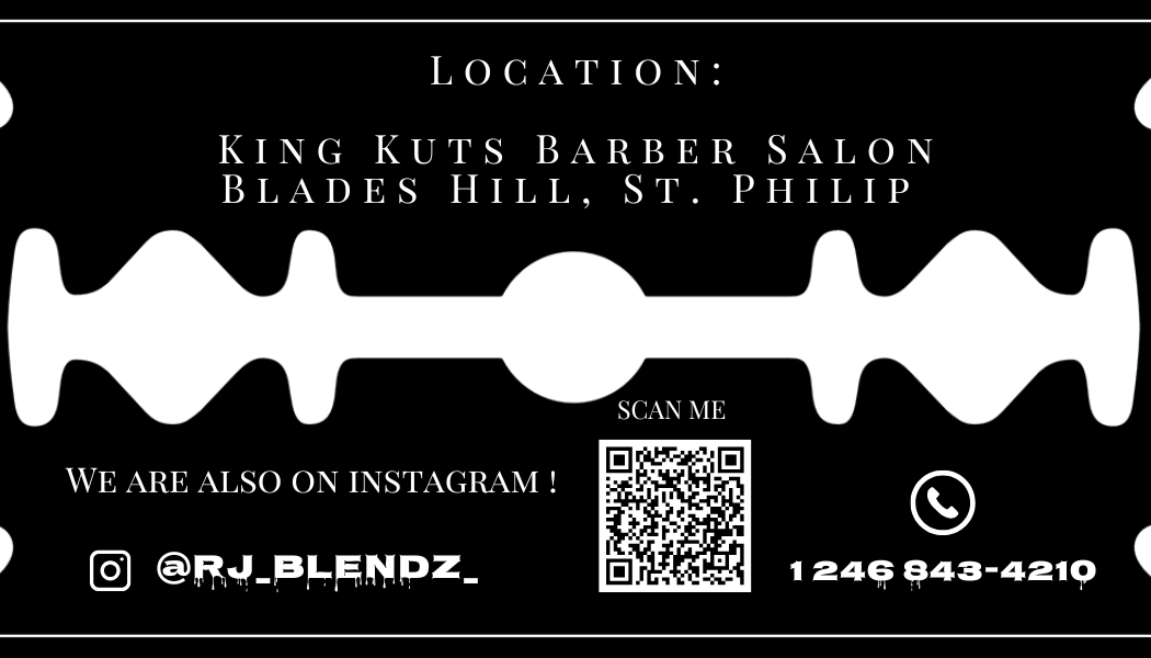
QR Code: A scannable code linking directly to your website, portfolio, or contact details.
-
Services Offered: A very brief list if your services aren't immediately clear from your title.
-
Design Principles for Impactful Cards
1. Simplicity is Key: Don't overcrowd the card. A clean, uncluttered design is easier to read and more professional. Focus on the most important information.
2. Readability: * Font Choice: Select fonts that are legible at a small size. Sans-serif fonts (like Arial, Helvetica, Open Sans) are generally good for body text, while a slightly more decorative serif or script font can be used for your name or logo for personality, as long as it's readable. * Font Size: Main contact information should be at least 8pt. Your name can be 10-12pt. * Color Contrast: Ensure good contrast between text and background colors. Dark text on a light background or vice-versa works best.
3. Visual Hierarchy: Guide the viewer's eye. Your logo and name should be most prominent, followed by your title, and then contact information.
4. Consistency with Brand Identity: * Colors: Use your brand's official color palette. * Typography: Stick to your brand's established fonts. * Imagery/Style: Maintain a consistent visual style that reflects your overall brand.
5. Layout and White Space: * Balance: Distribute elements evenly to create a visually pleasing balance. * White Space (Negative Space): This is the empty area around elements. It's crucial for readability and making the card feel less cluttered and more sophisticated. Don't be afraid of it! * Bleed Area: Always design with a bleed margin (extra space around the edge that gets trimmed off) to prevent accidental white edges if the cut isn't perfectly precise. A standard is 1/8 inch (3.175 mm) beyond the trim line. * Safety Margin: Keep all essential text and logos within a safety margin (usually 1/8 inch inside the trim line) to ensure they aren't accidentally cut off.
6. Double-Sided Design (Leveraging Both Sides): * Front: Typically features your logo, name, and maybe tagline. * Back: Often holds contact information, a list of services, a QR code, or even a compelling image. Using both sides effectively doubles your space without increasing physical size.
Material and Finish Considerations
The physical attributes of your card significantly impact its perceived quality:
-
Card Stock Thickness (Weight): Thicker cards (e.g., 16pt or 300-350gsm) feel more substantial and luxurious than flimsy ones.
-
Finish:
-
Matte: Non-glossy, sophisticated, and easy to write on.
-
Glossy: Shiny, vibrant colors, but can show fingerprints and be harder to write on.
-
Silk/Satin: A smooth, muted sheen; a good compromise between matte and glossy.
-
Uncoated: Natural, tactile feel, absorbs ink well.
-
-
Specialty Finishes (Premium Touches):
-
Spot UV: Glossy coating applied to specific areas (like a logo) for a subtle contrast.
-
Foil Stamping: Metallic foil (gold, silver, copper, etc.) pressed onto the card.
-
Embossing/Debossing: Raising or indenting specific elements for a tactile effect.
-
Die-Cutting: Cutting the card into a unique shape.
-
Edge Painting: Coloring the edges of a thick card.
-
Common Mistakes to Avoid
-
Too Much Information: Overloading the card makes it look messy and difficult to read.
-
Poor Readability: Tiny fonts, low contrast colors, or overly stylized fonts.
-
Inconsistent Branding: Colors or fonts that don't match your brand.
-
Low-Resolution Graphics: Blurry logos or images look unprofessional. Always use vector graphics for logos and high-res images (300dpi for print).
-
Lack of White Space: Makes the card feel cramped and overwhelming.
-
Ignoring Bleed/Safety Margins: Risks having elements cut off.
Designing a business card is about creating a tiny, powerful ambassador for your brand. When done thoughtfully, it can leave a lasting impression and open doors to new opportunities.
Share


